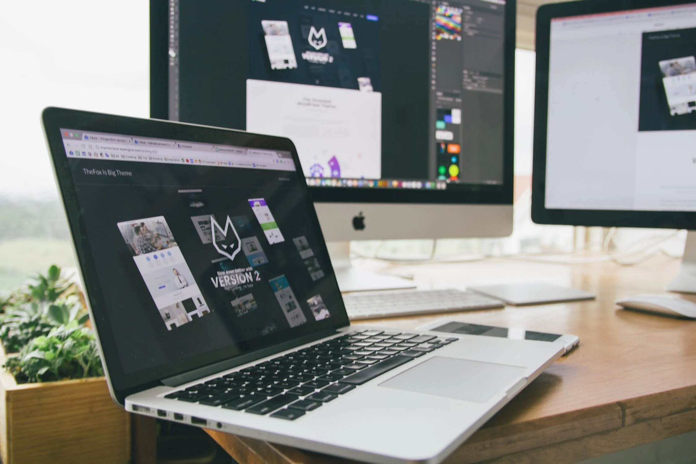
It’s a new decade and you might be looking to upgrade your branding and logo design. As a business owner, you probably invest a lot of time and money into your property and equipment and the same should go for your logo. Don’t make the rookie mistake of not suitably investing for a professional design. In a world that’s full of trends, it can be hard to avoid them. Keep reading for 3 big trends to avoid if you are in the market for a new logo design.
1. Color Selection
Everyone loves color and more than likely your designer sent you a black and white version of your logo before sending you color options. This is where it can be tempting. Colors go through phases and you will find that often, people choose branding colors based on what is trending or what they are seeing the most of in other companies branding. This is a common mistake, but one you should avoid. We have all heard of millennial pink. Just because pink is trending and popular, doesn’t mean it accurately describes your brand. Try and avoid picking a color or theme, just because of its popularity. Work with your designer, dig deeper, and try to pick a color scheme that complements and enhances your logo and brand.
2. Too Much
There is a lot of pressure when branding or rebranding your company to have a unique, never been done before logo. This can push and cause your designer to use lots of layering, too many colors, and become too intricate. This trend was seen a lot in 2019, probably from a desire to create something new and innovative. Although there is always that pressure, the logos that have stood the test of time share one common factor: simplicity. You absolutely cannot go wrong with a concise, but well thought out logo design. Your logo design needs to be simple yet effective. Avoid being tempted by a complex design. It’s also worth noting, that highly detailed designs don’t scale well. If it’s too small, you will lose detail and those details might end up looking like mistakes.
3. Trendy Typefaces
I know we talk about typefaces a lot here and that’s because so much rests on their shoulders. A good typeface can make a brand memorable and unique, while a bad typeface can instantly make your design look unprofessional. As you know, each typeface has a personality, and knowing this information, you need to make sure that personality matches the personality of your brand. This is where you should rely on your designer to pick a typeface that is timeless and fits the message you are trying to convey. The same rules as above apply; simplicity over flash. Don’t try and include too many typefaces. This is an instant recipe for an amateur looking logo. Skip the trends and stick to the golden rule of only having one to two typefaces in your logo design.
We could go on and on, but hopefully, you have learned how to avoid a trendy logo design. Here at The Burnette Agency, we handle branding, websites, logo development, marketing, and more. If you are interested in finding out more information, please don’t hesitate to reach out! We’d love to hear from you! You can reach The Burnette Agency by email at info@theburnetteagency.com or give us a call at 404-850-2081.

